Configuration Best Practices
Best practices for configuring CHT Applications
This section covers the configuration best practices of forms, tasks, targets, and contact profiles when building your own community health app.
Forms
We use forms to build the Tasks, Care Guides, and Reports that take health workers through care protocols and provide decision support for their interactions with patients.
In this context, a form is any document with questions and blank spaces or selectable options for answers. Forms can be found in many parts of your app including the Tasks, People, and Reports tabs
While both Tasks and Reports are built with forms, there are key differences. Tasks are blank forms that need to be completed, while Reports are forms that have already been submitted. When a Task is completed and submitted, it automatically becomes a Report.
Note: The icons and titles that we choose for Tasks remain the same when they become Reports.
Anatomy of a Task
The Task tab shows a list of upcoming visits, follow-ups, or other tasks that need to be completed. When a task is finished, it will automatically clear from the Tasks list and move to Reports.
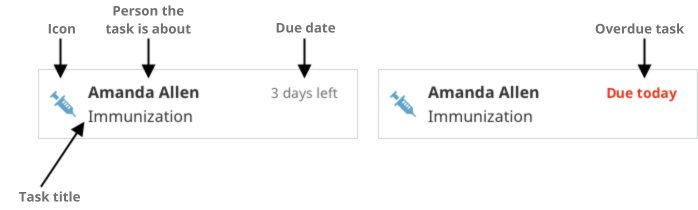
Anatomy of a Task
Each Task has an icon on the left side which indicates what type of Task it is.
The first bold line of text is the name of the person or family that the Task is about.
The second line of text is the title of the Task.
The days left for the Task to be done is located in the upper right-hand corner.
If a Task is overdue, the due date will be red. Tasks are listed in order of due date.
Anatomy of a Report
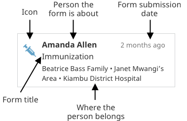
Anatomy of a Report
The first line of bold text is the name of the person whom the Report is about.
The second line of text is the title of the Report.
The third line of text is the hierarchy of place to which that person belongs.
In the upper right corner, a timestamp displays when the Report was submitted.
Reports are sorted by submission date, with the most recently submitted Reports at the top. If a Report is unread, the timestamp will be bold blue and there will be a horizontal blue line above it.
Titles
The patient’s name should not be included in the form title.
❌ Don't do this: "Beatrice Bass Delivery Follow-Up"
✅ Do this instead: "Delivery Follow-Up"
Avoid generic words like “Visit” or “Report”. Every form can be a Report and often involves a visit, so including these words in the title doesn’t help differentiate it from other forms.
❌ Don't do this: "Delivery Follow-up Visit"
✅ Do this instead: "Delivery Follow-Up"
Each word in a title should be capitalized (Title Case).
❌ Don't do this: "Delivery follow-up"
✅ Do this instead: "Delivery Follow-Up"
Keep form titles short and concise. Long titles will sometimes be truncated (cut off with an ellipsis) and the text at the end of the title might be lost. As a rough estimate, strive to keep titles no longer than 40 characters in length.
❌ Don't do this: "This Title Has Way More Than Forty Characters And Is Too Long"
✅ Do this instead: "Title Is Less Than Forty Characters"
To help estimate how much text can be displayed before truncation, you can use the low-fi mockups here. If you type your form name into the mockup you can get a rough idea of how much text will fit before truncation occurs. Note that the mockups have been made with our smallest screen sizes in mind. Some users’ screens will be larger and will be able to display more text.
The screenshots here represent some of the smallest phones our users have. As you can see, on both the Tasks and Reports pages, titles less than about forty characters will fit in the space. Titles longer than about forty characters might be cut off with an ellipsis (…).
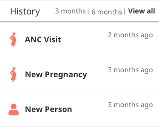
History
Icons
The Community Health Toolkit includes a collection of 60+ free icons that represent key elements of different community health workflows and protocols. Review the recommended usages that follow.
| Icon | People and Places Hierarchies |
|---|---|
 | Hospital or District |
 | CHW Area |
 | Branch or Health Facility |
 | Family |
 | Person |
| Icon | Family Planning |
|---|---|
 | - Family Planning Screening - Family Planning Referral or Follow-Up |
| Icon | ANC |
|---|---|
 | - ANC Registration - ANC Visit or Missed Visit - ANC Follow-Up |
 | - ANC Danger Sign - ANC Danger Sign Follow-Up |
| Icon | PNC |
|---|---|
 | - PNC Registration - PNC Visit or Missed Visit - PNC Follow-Up |
 | - PNC Danger Sign - PNC Danger Sign Follow-Up (Mother) |
 | - PNC Danger Sign Follow-Up (Baby) |
| Icon | ICCM and Child Health |
|---|---|
 | - ICCM Assessment - ICCM Treatment - ICCM Referral or Follow-Up |
 | - ICCM Danger Sign - ICCM Danger Sign Follow-Up |
| Icon | Immunization |
|---|---|
 | - Immunization Visit - Immunization Follow-Up |
| Icon | Visits |
|---|---|
 | - General Follow-Up - Proactive Visit - Educational Visit |
| Icon | Community |
|---|---|
 | - Community Event - Community Meeting |
| Icon | Various |
|---|---|
 | Delivery |
 | Malnutrition |
 | Growth Monitoring |
 | Cognition |
 | General Forms |
 | General Assessments |
 | Equity Survey |
 | Bed Net Distribution |
Content and Layout
Group Related Information
Users think in batches, and long forms can feel overwhelming. By creating logical groups the user will make sense of the form much faster.
Ex. Visit Details, Danger SignsOrder the Form Logically and Only Ask What’s Required
Keep questions concise and in an intuitive sequence — they should be asked logically from a user’s perspective. This makes the flow from one set of questions to the next better resemble a conversation.
Ex. Is your patient still pregnant? → Did she attend the ANC visit? → Does she have danger signs?Reflect Input Length in Field
Employ this for fields that have a defined character count like phone numbers, zip codes, etc.
Input Length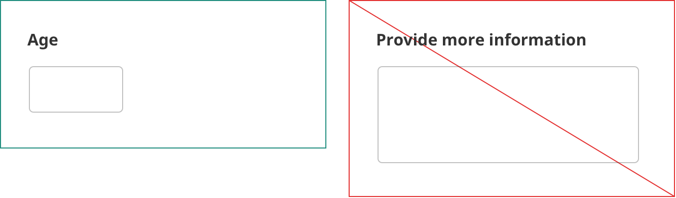
Don’t Put Placeholder Or Helper Text Inside The Form Fields
People go through forms quickly and if a field looks like it already has an answer they may accidentally miss it. Research shows that empty fields draw more attention than those with placeholder text.
Placeholder Text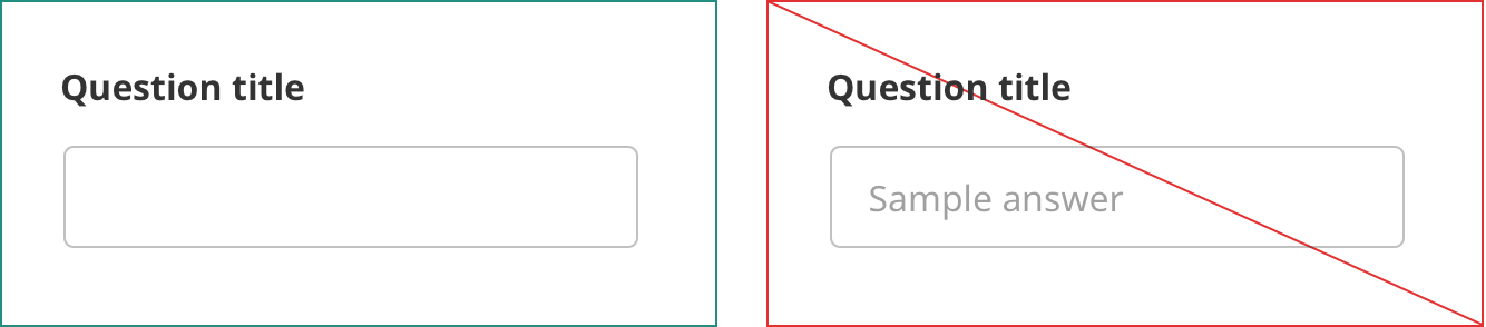
Distinguish Optional And Required Fields
Users don’t always know what is implied by the required field marker ( * ). Instead, denoting what is optional is a preferred method, especially for forms with many required fields. If you do use asterisks, make the meaning of the symbol clear by stating “Fields with an asterisk ( * ) are mandatory.”
Always Stack Radio Buttons And Checkboxes In A Single Vertical Column
Placing the options underneath each other allows for easy scanning and makes it less likely that a user will completely overlook one of the options.
Radio Buttons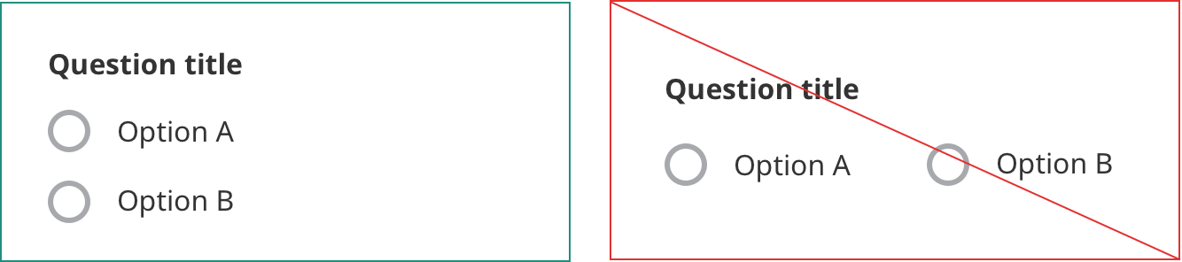
Don’t Use Dropdowns If There Are Less Than Seven Options
For smaller lists, use radio buttons instead of drop-down menus. Radio buttons have lower cognitive load because they make all options visible for easy comparison.
Radio vs Dropdown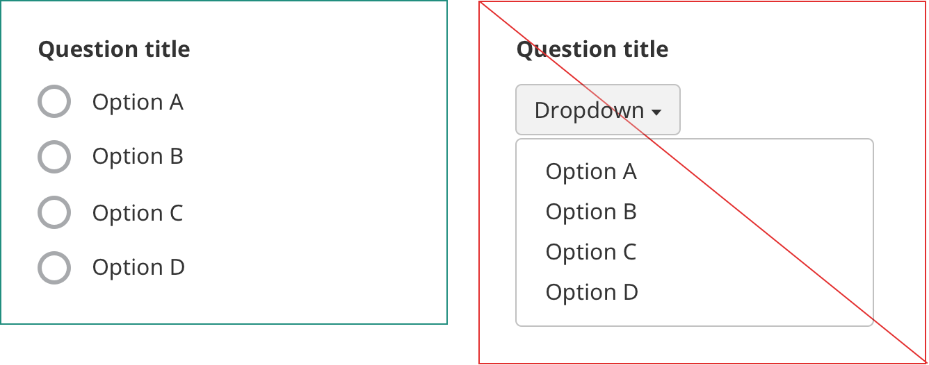
Make Use Of Images
Where it makes sense, use images to aid in the understanding of a question
Form Images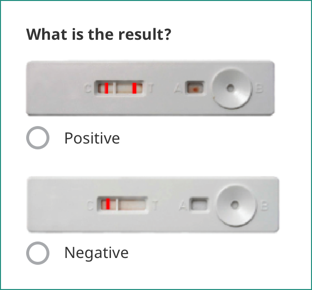
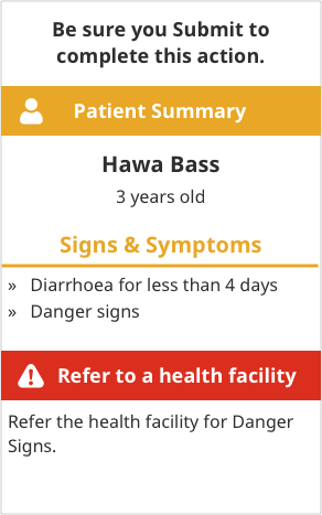
Summary Page
After all of the required questions in a form are answered, a summary page is displayed. Here, health workers can review the information they entered into the form, receive instructions for treatment, care, and referrals, and relay detailed educational information to the patient.
Note: The form is not submitted until the user scrolls to the end of the page and clicks “Submit”.
All care guides are defined using ODK XForms, an XML definition of the structure and format for a set of questions. Since writing raw XML can be tedious, we suggest creating the forms using the XLSForm standard, and using the cht-conf command line configurer tool to convert them to XForm format. Because the XLSForms are converted directly to XForms, they essentially are the form, and so it’s important that the XLS be set up properly and consistently. Read more about configuring forms here.
Page Sections
General Section Order
Not all forms will have all summary sections, but the sections that appear should be in this order:
- Reminder: “To finish, be sure to click the Submit button at the bottom of the form.”
- Patient details (name, age etc.)
- Visit information (summarizes the info that was just captured in the form)
- Signs and symptoms (if applicable)
- Refer to a health facility warning message (if applicable)
- Diagnosis and treatment (if applicable)
- Healthy tips/educational info (if applicable)
- Follow-ups scheduled (if applicable)
- Submit button
Section Headers
Section headers are used to separate content sections of the summary page. They make the page easier to scan and they make it easier to find a specific section.
There are suggested orders, colors and icons for section headers. A section should only be visible if it contains content (ie. headers should never be stacked directly on top of each other).
To ensure that headers only show when they have content the relevant condition for the section header should join the conditions of all the subfields.
Ex. {condition_a} OR {condition_b} OR {condition_c}Header Text
- The text inside of the section headers should be “H1”: Noto Sans 18px bold
- The text should be centered vertically & horizontally in the bar
- Each section header title should be Title Case, meaning each word is capitalized e.g. “Patient Details”
Header Color
Though it may be tempting to give each section has a unique color (e.g. “Patient Details” is yellow, “Healthy Tips” is blue etc), sometimes there are too many sections for each one to have its own color, other times the various colors just look jarring and confusing. In general, you should strive to use color in a way that adds meaning and improves understanding, and avoid using color in a purely decorative manner.
- If you choose to use multiple header colors, ensure that every header is a unique color. For example:
- yellow: #e2b100 - patient details
- blue: #6b9acd - visit information and key health messages
- lime: #b5bd21 - child health
- red: #e00900 - warnings and danger signs
- green: #75b2b2 - follow up (at the end)
- If you find you have more sections than you do colors, it may be best to just make all the headers a single color (with the exception of warnings or referral messages, which should remain red). In this case, blue is a good default color to fall back on.
Header Icons
Each section header should have an icon on the far left side. The icons should all be colored white, and should all be the same size. These icons should be unique for each section (no repeat icons)
Suggested icons for each section:
| Icon | Section |
|---|---|
 | Patient Details |
| Visit Information |
| Pregnancy Specific |
| Child Health Specific |
 | Signs and Symptoms |
| Warnings and Referrals |
 | Diagnosis and Treatment |
| Follow-Ups |
 | Misc/General |
Text styling
H1: colored horizontal bars for section headers
H2: text with a colored line under it, centered
H3: left aligned text, simple grey line under it
H4: normal body text
Summary
Other body text styling
- Bold text is indicated by ** or “bold” or
<strong> - Italic text is indicated by * or “italic” or _
- List item is indicated by either specifying li in the appearance column or formatting the label text using html tag li
- Numbers: needs to be hard coded
- H1, h2, h3 …, em, i, ul, li, p, span html tags work as expected including use of the style attribute within the tags e.g
<i style=”color: red”></i> - Explicit new line space translates to a new line (
\ntranslates to a hard break) - You could potentially specify an inline list using standard html
<ol><li>Blah</li></ol> (ordered list)<ul><li>Blah</li></u> (unordered list)
<ol style=”margin-left:1em”></ol>. You can also customise the bullet style and position using what’s specified in the HTML spec.Ex. <ol style="list-style: decimal inside;"></ol>Condition Cards
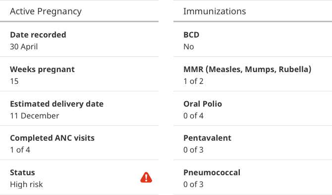
A condition card is a configurable card that can be displayed on a profile that shows information that was submitted in or calculated from reports. Their purpose is to reveal important information in an easily viewable location.
This information can be organized into cards specific to a condition (e.g. pregnancy, malnutrition) as well as past conditions, and set to display for any length of the time.
Condition Card
Configurable Elements
- Title
- Label for each data point displayed
- Data point for the field
- Icon for the field, if desired
Guidelines
Card Title
- Name of the condition, e.g. Pregnancy, Malnutrition, Malaria
- Define if condition is past, e.g. Past Pregnancies
Field Label
- Label each data point displayed
- One line
Field Content
- Can include any information that was collected in a form or multiple forms about the person
Ex. LMP, EDD, most recent case of malaria, past pregnancies and their delivery dates- Can display Notes
- Data can be displayed in the following formats:
- Number
- Count towards a goal
- Percentage
- Date
- Text field
- Fields in cards are dynamic and will update as new information is submitted
Ex. # of ANC visits so far, change in risk status- Fields can include icons
Ex. High risk status on an Active Pregnancy card- Icons should be selected from Medic’s icon library and should be displayed at our standard 30 x 30 px size
Displaying Cards
- Can be configured to show and hide at the appropriate time
Ex. Show the EDD of the current pregnancy until a delivery Report is received, show that a child is being treated for malnutrition until the treatment is complete, show that a child had malaria until 2 weeks after diagnosisCondition cards can be configured to disappear at the end of the condition or persist for any length of time
Can be added to a person or place profile
Ex. Equity scorecard on household profile; CHW performance scorecard on CHW profileDesign Considerations
- Group information related to the same condition so that the user can easily understand the relevance of the data and find what they are looking for.
Ex. Pregnancy Card, Immunization CardConsider what a user will do with the information before deciding to display it. More info isn’t necessarily better; what does a CHW need to know and how will they change their actions as a result?
Past condition cards may be best displayed as a summary of multiple past conditions rather than individual conditions
Ex. Summary of past pregnancies rather than card for each past pregnancy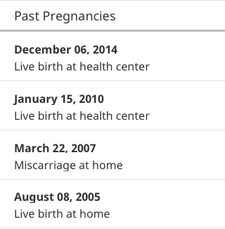
Past Pregnancies
Targets
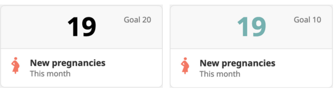
The Targets tab shows key performance indicators. Progress numbers are calculated automatically by the app, and goals are set by the organization. We currently support two types of widgets: Counts and Percentage-based bars.
Counts
- Counts show current totals and will update as reports are created
- If there is a goal, it will be displayed to the right of the count. If the count is green, the goal has been met. If the count is black, the goal has not yet been met
- Goals can only be met by exceeding them, you cannot set a goal which is met by being under the goal.
Targets
Percentages
- Percentage bars show progress towards completing certain reports. The colored part of the bar will update as reports are created.
- If there is a goal, a line will be on the bar to mark the goal. If the bar is green, the goal has been met. If the bar is black, the goal has not yet been met.
- The text below the bar shows how the percentage is calculated, displaying the number of Reports that met the requirement out of the total number of Reports.
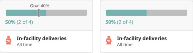
Percentages
Configurable elements
- Title text (free text)
- Subtitle text (two options: all-time or this month)
- Icon (selected from our icon library)
- Presence of a goal (or not)
- Value of the goal (per widget, not per user)
- Number and placement of widgets of either type.
Guidelines
Title
- The data point being measured. No need to include “%”, the word “percent”, or the word “count” (these are stated elsewhere) or any information on timeframe.
- Titles should be 40-50 characters max.
- All text should be set in sentence case (meaning the first letter of first word is capitalized, all other words lowercase, except for acronyms)
- If hyphenation is needed, words should only be broken at syllables
Ex.
    - % Newborn Care Visit Within 72 hours → Newborn visits within 3 days
    - % of Under-5 Referrals Followed-up within 24 hours → U5 referral follow-ups within 1 day
    - % of Fever Tested with mRDT → Fever tested with mRDT
    - Pregnancies Registered This Month → Pregnancies registered
    - Births This Month → New births
    - Deliveries at Facility All Time → Deliveries at facility
Subtitle
- The subtitle is where timeframe information lives, expressed as either “This month” or “All-time”. For now, these are the only two options. All text should be set in sentence case.
Bars
- Has to have a numerator and a denominator – comparing two things, and not more than two at this time (can’t do: % of deliveries at (1) home unskilled vs. (2) home skilled vs. (3) facility. Any two of these would work though, including (1) all home deliveries vs. (2) facility deliveries).
- It is possible to account for things that haven’t happened. For example, if you are measuring PNC visits that happened within 1 week of delivery, you can determine whether a particular woman should have had a PNC visit based on her EDD.
- There are several ways to account for things that have and haven’t happened, and happened late, depending on what you are trying to show.
Ex. Configurations for visit attendance:

      - Of all the visits that happened, how many were on-time? (doesn’t look for visits that didn’t happen)
        - On-time = true, Late = false

      - Of all the visits that were supposed to happen, how many were on-time? <br>
        - On-time = true, Late + didn’t happen = false

      - Of all the visits that were supposed to happen, how many actually occurred? (includes on-time and late as having happened)
- On-time + Late = true, Didn’t happen = false- It’s not possible to total up forms from all household members or check to see if any family member had a form submitted this week and count that as the household being visited. If you want to count the households visited this month, you need a form submitted at the household level like a household visit form or a household survey form.
- Denominator must be the same for both sides (e.g. kids in our immunization program). Can’t split it into kids <2 yrs on one side and kids <5 years on the other side. Bars must progress positively (ex. Visits completed, not visits missed)
Unique Considerations for Personas
CHWs:
- Will be viewing on a mobile device; keep in mind the number of widgets you display
- Information is related to their own individual achievement, not comparisons with peers or aggregates for their facility
- May have a difficult time understanding percentages (however certain partners like LG still focus on % based targets and therefore it still needs to be included). Percentages are good for evaluating performance, but difficult to “act on” because depending on how many actions you have already done / left to do, it may not always be clear or possible to “achieve” a percentage goal.
- Targets data is always up-to-date even when offline, but important to know when they’ve last synced and sent data to managers
Managers:
- Could be viewing on desktop or mobile device; may be seeing widgets side-by-side
- Want to view overall summary of CHW goals, may also have their own personal goals
- Can only see widgets for which they have Report access
- Understand, and need, percentage information in order to evaluate performance
- Important to know how up-to-date the data is (will be addressed in a different feature for CHW last sync date)
Did this documentation help you ?